
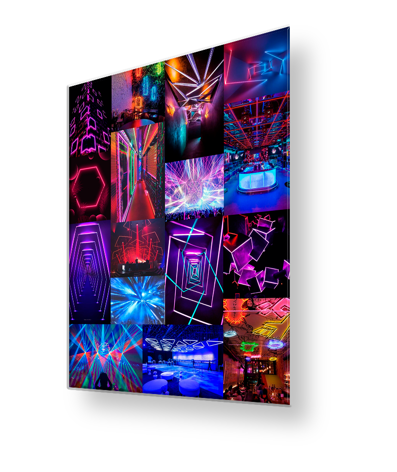
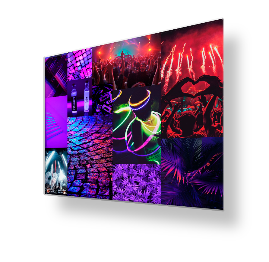
For inspiration, we went to the «field», namely to parties. It was there that most of the key insights visited us. A party is a night and bright colors of light on the faces of happy people.
Inspiration

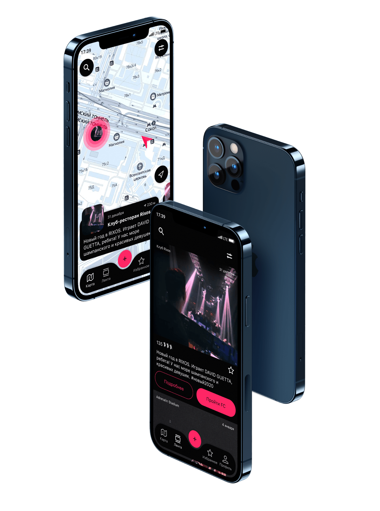
Parties are mostly a night event, so the dominant color in the app is black. White for text, secondary color gray and display color pink.
Colors

Mobile application for finding and creating parties on the map with the ability to pass face control and dress code online
FlexApp



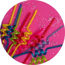
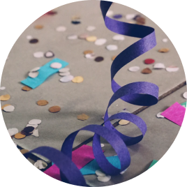
The metaphor of the logo is spiral confetti and a cocktail tube, in the form of which the letter «F» is made
Logo Formula

F
=
+

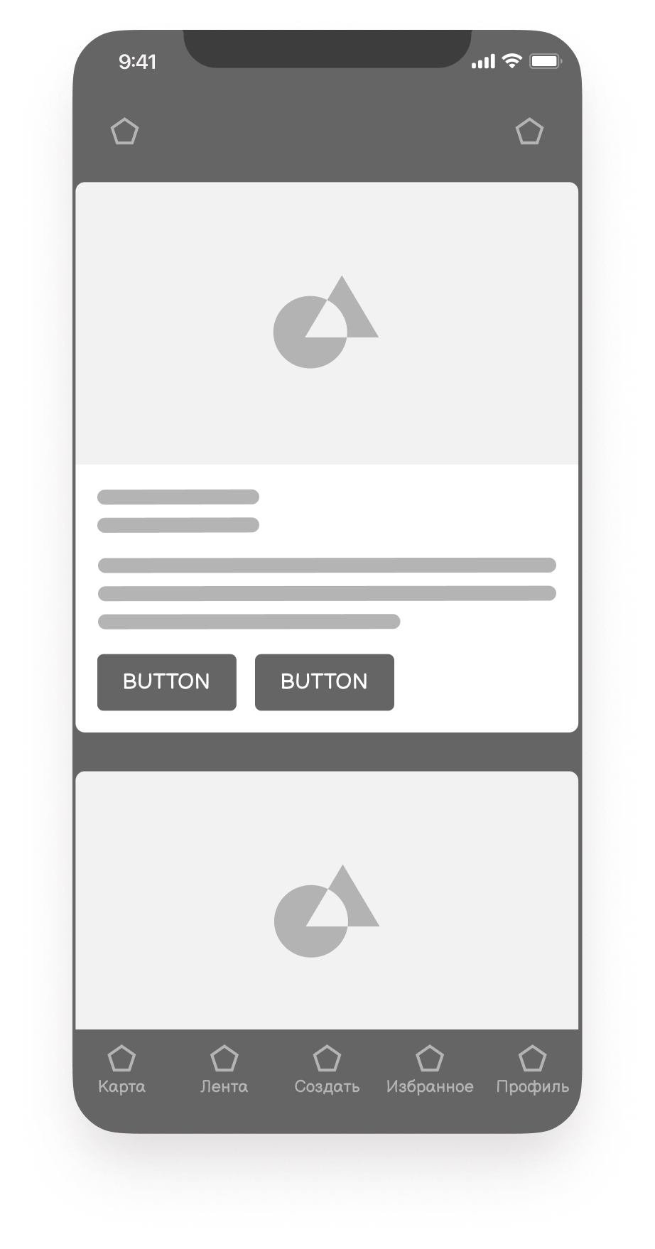
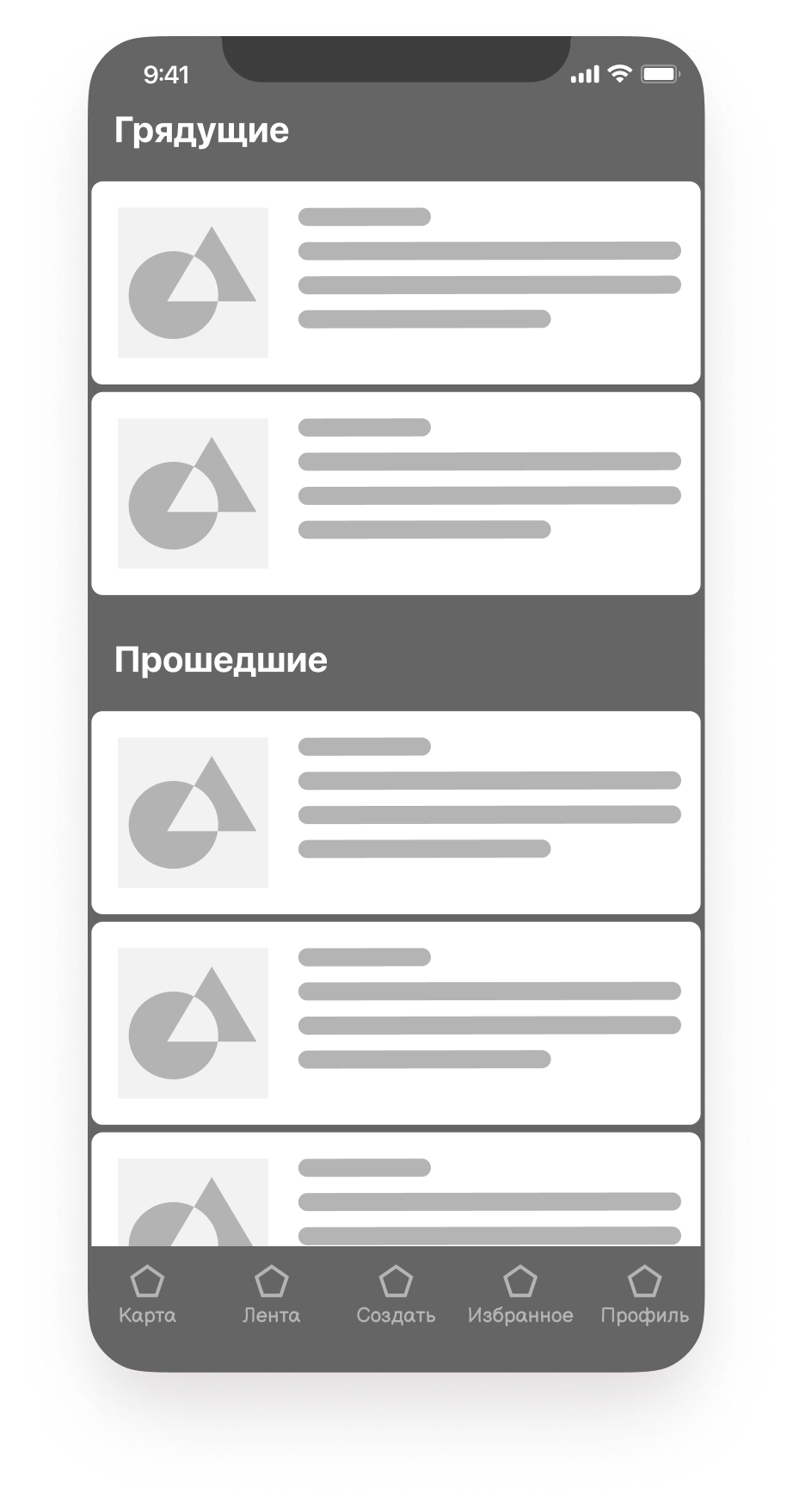
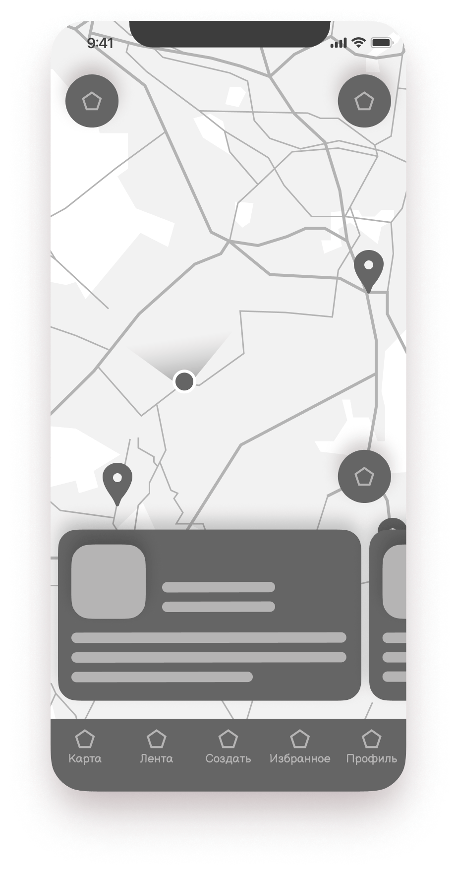
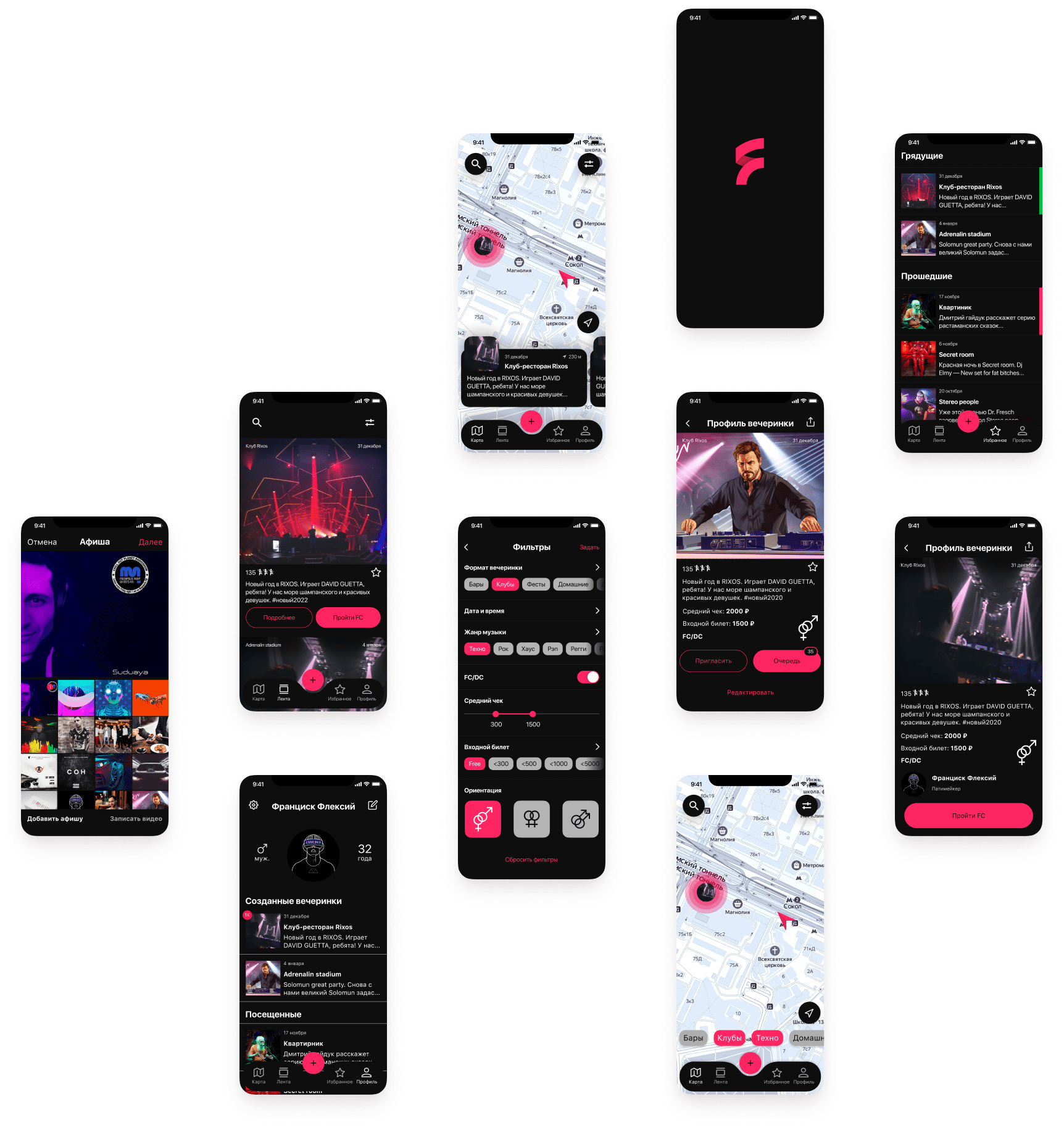
After competitive analysis, drawing up user portraits, navigation model, data model and prototyping, we move on to visual and think over the UI
CJM

And already on the clickable layout, user testing is carried out, errors are corrected and a UI-kit is created with various states of elements, buttons, input fields in the form of components, from which the final layout is assembled and transferred to development
Launch

